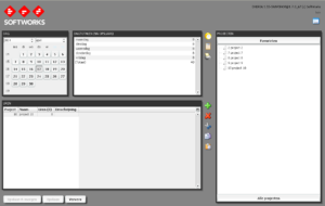
Full circle – the applet is here to stay?
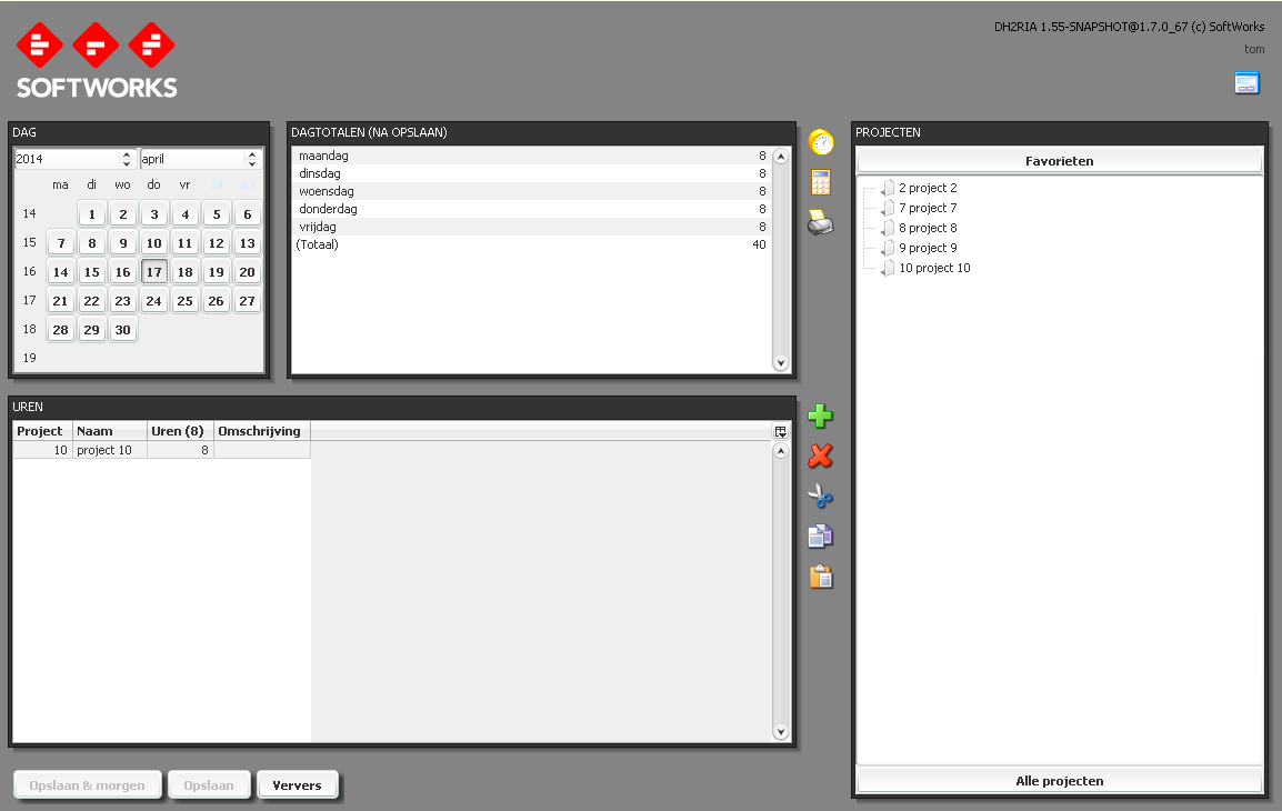
For those who have been following my blogs, or heard my ‘One application to rule them all’ talk, know that I’ve been hanging a lot of my spare time experiments on my hour registration applet. It has served me well for over a decade, but the fact that browsers no longer support applets forced me to make decisions on how to maintain that functionality.
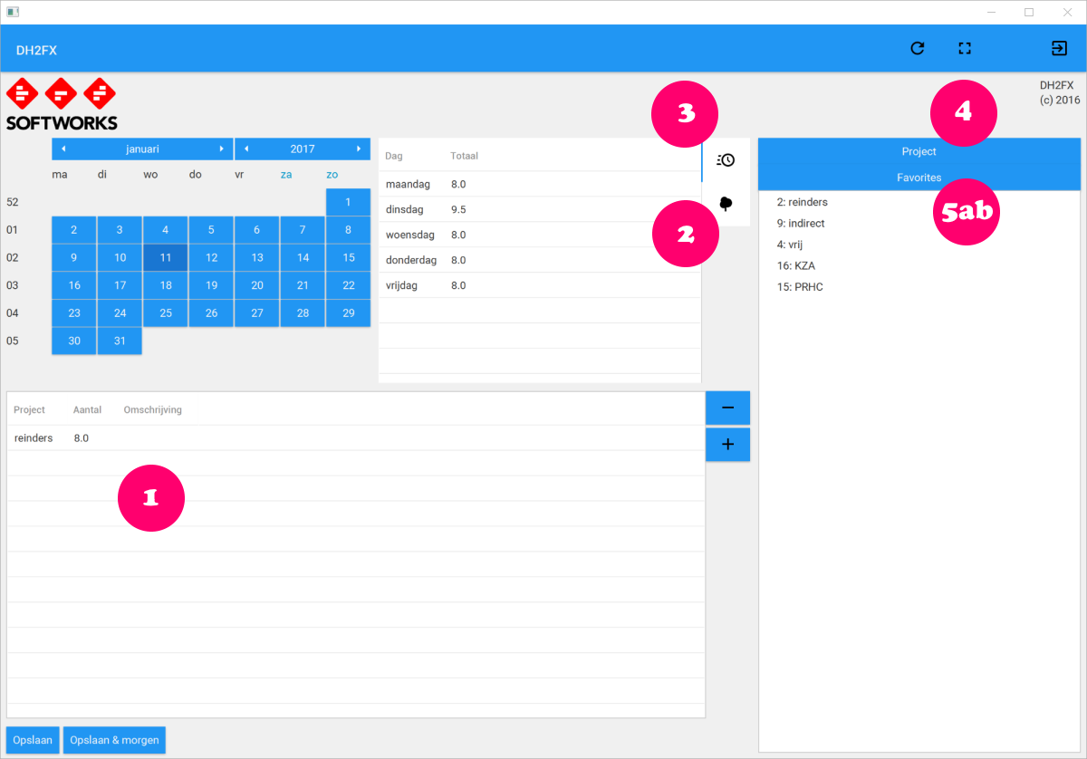
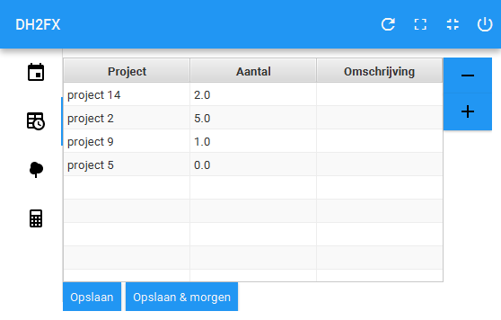
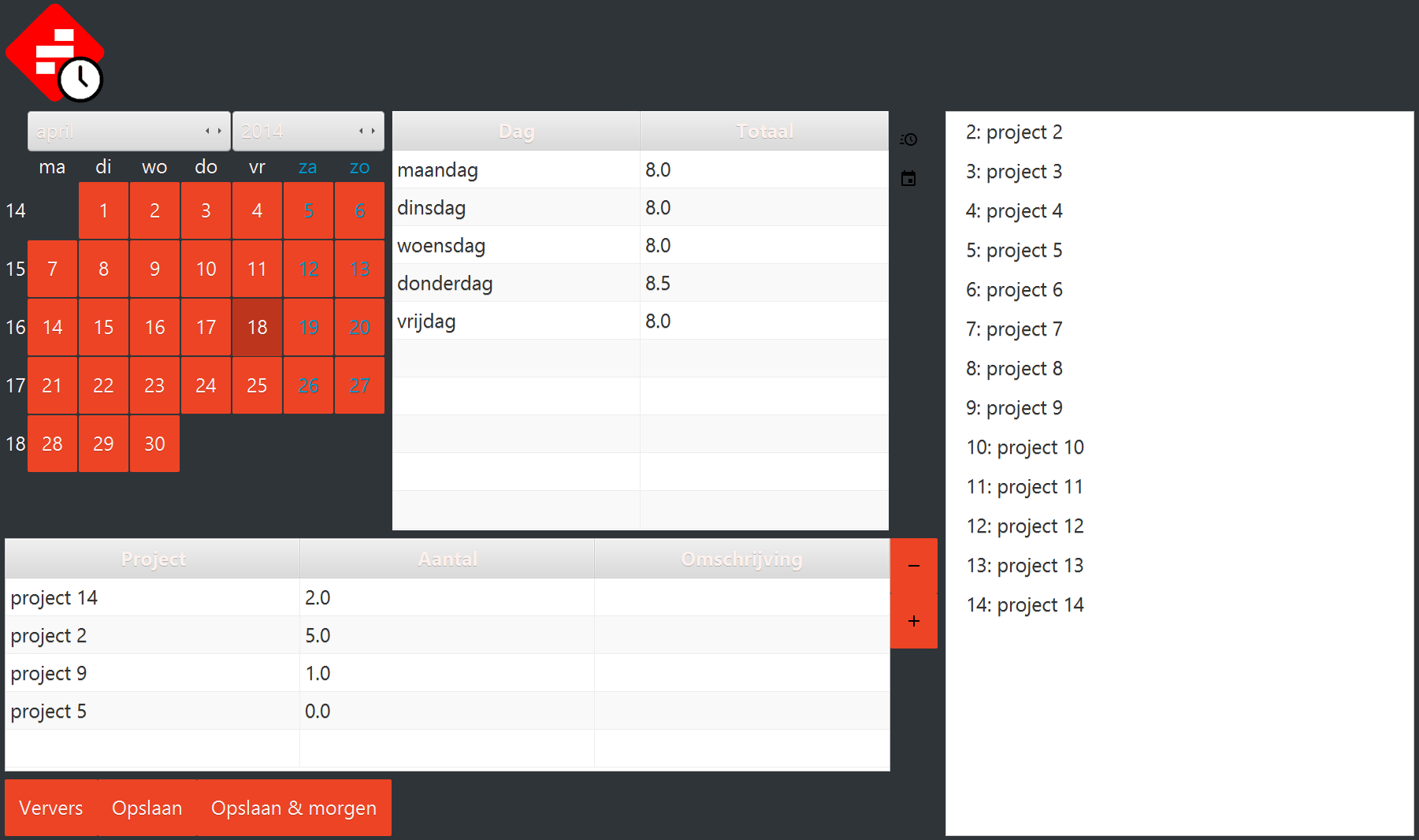
The simplest approach would have been to convert the applet into a stand alone application. Not that big of a hassle; login screen, connect to the HTTP back end, and off you go. But I decided to try and write a JavaFX application instead, with a login screen connecting to that back end, which is able to run on multiple platforms. Just for the sake of experience.
But the discoveries made during this effort have uncovered some interesting gems, and I wanted to share this one: CheerpJ. It runs any old fashion applet in a browser via Javascript, without any changes to the code!


