KPCalendarPicker
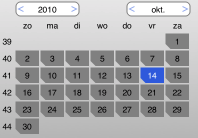
In the previous posts about UIOverlayView and KPMiniPickerView I’ve already talked about my calendar picker test case that I use to “hello world” new UI platforms. So far there is a Java Swing version, a JavaFX 1.3 version, the JavaFX 2.0 version is in the works, and there is a iOS (iPhone / iPad version).
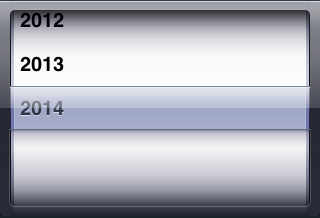
The main excuse I had to write one for iOS is, because I found the normal picker to have a few drawbacks:
- It is inaccurate; if I want to go back, say, 10 days, I give the thing a swipe and have to hope it stops somewhere around 10 days.
- It takes up a big chunk of screen, relatively, for the information being shown.
- The styling of the UIPickerView in general is not easily fitted into another look and feel; the rolodex-in-a-box look is very distinctive.
It is totally clear what Apple tries to do with the UIPickerView, but I do not believe that UI controls modeled after real world things (like a rolodex) are a good idea. History has shown us that writing computer programs in languages styled after human languages (Cobol) is not working out well either; all though there is something in common, the two worlds are far more different than alike. And the more I see UI’s made up of thing resembling real world objects, the more I get the feeling that they are not working out very well (the occasional exception excluded naturally). (more…)


