ResponsivePane
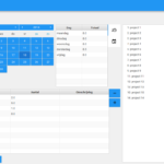
In the previous posts I have blogged a lot about the ‘one code base’ application that runs on all popular platforms, from desktops like PC and OSX, mobile like Android and iOS, and finally on web with the use of JPro’s brilliant library. The core of that application was the fact that depending on the available screen size, or better: scene size, a different layout was automatically selected. Below on the left the MigPane based layout for desktop, on the right the same controls put into a TabbedPane for mobile.
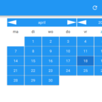
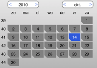
Beside changing the actual layout, also a different stylesheet was automatically loaded, so (for example) the arrows in the data picker became more touch friendly. This worked perfectly, even dynamically adapting as you resized the application while running on the desktop or in a web browser. However, the code for doing this adaptive layout was intermixed in the application, and I decided to extract it into a layout manager called ResponsivePane. (more…)


