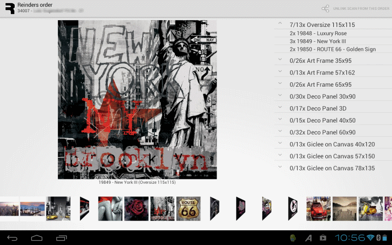
One of my clients allowed me to write an Android application. I have done Java and mobile development before, so it basically comes down to learning the new framework. And that’s something Java developers do on a fairly regular basis. There were some special things, like connecting to a bluetooth barcode scanner, but nothing that some coding-by-googling wouldn’t fix. The application initially was aimed at Android 2.2+ and phones, but in the meantime it’s been upgraded to Android 4.0+ and 10″ tablets, because it needed a stronger visual screen (with loads of images) and the screens of the phones were simply too small.I’d like to share some of the experiences I had with this project.
Getting started was a breeze. After the cumbersome procedure with iOS and its certificates (and the 100 dollar), just downloading the SDK, setting a phone to “debug over USB” and connecting it, is a very liberating experience. I understand the need Apple has for its approach in light of public apps and the appstore, but this is a company internal app.
Onto the coding. The concept of Activities and their life cycle also is easily understandable. Of course the fine points require attention (like what happens to the bluetooth connection when the screen rotates), but it quickly is clear why problems occur.
So it is easy to get a running app and have it deployed to the phone. And then the actual building of the app begins. And basically it involves adding stuff to all kinds of XML files containing layout, translations, menu’s, and then adding the loader and handler code in the associated Java class. All is straight forward and to the point, just layout and code, and there are some tools like RoboGuice to make life easier. But this is also where Android is starting to show some cracks.
The things I have the most ‘beef’ with are the layouts (again). Android is made to support screens of different sizes and resolutions. In order to support these screens, the layout has to adapt, be flexible. In all the articles about this topic, the RelativeLayout is mentioned as the layout manager of choice.
Relative layout specifies positions of components relative to each other or the parent. The strange thing is; it only specifies the position, but not the size of the components. What in the world is the value of being able to tell that one thing is to the right of the other, if you can’t say how they should divided their space in a similar relative fashion? All discussions about this problem come to the same solution: use nested hortizontal and vertical linear layouts, because this layout allows for relative sizing. In my book this comes down to: relative layout is not practically usable.
Another strange thing is the deprecation of AbsoluteLayout. This decision is defended with the statement that it does not support flexible layouts. Initially you go like “ok, that somewhat makes sense”, until you run into the fact that Gallery is deprecated as well. Gallery is the component that allows swiping through a bunch of images, but it has a memory leak problem, which becomes a problem if showing more than about 50 images. Now, instead of fixing that (fairly minor) issue, it was deprecated. It’s not like people ever swipe through images anyhow. So you need to write your own. (There are a few attempts on the internet, but they all did not behave correctly.)
Creating a Gallery is not really that difficult. The ViewPager initially seems to have all you need (swiping support and all), but only shows one image at the time, instead of a ribbon. So a horizontal ScrollView is what is needed. ScrollView is a component where only a part of a larger canvas is displayed, this part is called the viewport. In order to minimize memory usage, what you need to create is a widget that determines which images are visible in the viewport and only loads and shows these. So on a horizontal ribbon of images, if all images are 100 pixels wide and the viewport is positioned at 1000 pixels, being 500 pixels wide, you need to load and show images 10 through 15. Now… What layout would suite best to load and show specific images at a specific x,y location?
I really hope your answer to that question was AbsoluteLayout (or else tell me what is a better solution). But AbsoluteLayout is deprecated, so we can’t officially use that. Is there an alternative? Google to the rescue and yes, there is an alternative: you can use margins in RelativeLayout to do absolute positioning…
This usually is the point where I need to pick up my jaw from the ground. Something is seriously wrong there; we’re deprecating the perfect fit, and start using a hack to get exactly the same behavior with exactly the same issues. Really?
In case of the custom gallery I used absolute layout anyhow. Somethings are simply a bridge too far for me to cross. Looking back to the JavaFX layout issues I raised, they suddenly do not seem so bad anymore. The max-size-means-grow still is a big thing to me, but that API? I can live with that, if it means decent layout managers.
Someone has already started porting MigLayout to Android, so I really hope it will be released as a nice jar, complete with layout XML support. But the best thing would be to have JavaFX available on Android. And iOS of course.
So, Oracle, …


