The ‘going electric’ will be different blogs from my usual beat. Not only because they will not be related (directly) to software development, but also because they are opinionated and personal reports; editorials about switching over to an electric car. They will list my personal joys and annoyances about the switch, but I’ll try to be fair and balanced.
Unexpected encounter
So my model S needed to go to the workshop; it seems my headlights were set a bit high (got a lot of flashes and my g/f complained when I was driving behind her), and there is a faint torquing noise coming from the right A-pillar when I drive on uneven roads. First world problems.
But while waiting on the intake on my S, I was asked if I wanted to take a peek at the Model 3. It has been on tour through Europe lately, but I missed the opportunity when it was at my local Tesla shop. So I was quite pleased with his suggestion and eagerly said yes.
Outside
The first impression of the car on the outside is really nice; smaller than the S, but I would have preferred that. I don’t need such a big car.
Screen
On the inside the 3 feels spacier than the S. Funny enough the screen felt very small, which amazed me. I guess it is because the one in the S may be a bit larger, but also is embedded in the dash, giving it a bulky presence compared to the light and almost flying position of the screen in the 3. Because compared to regular cars, 15″ still is a big ass screen. The horizontal layout and higher position is better than the vertical orientation.
Steering wheel
The steering wheel is smaller than the S’s, which I really like. The one in the S is a tad too big, although I have grown accustomed to it. I like the fact that the scroll wheels also have a sideways function. And that the left side only has one stalk; even after 3 months I keep mixing them up, and at times activate the turn signal when I intend to activate autopilot. I can’t really tell if I would miss the binnacle behind the steering wheel, I think I would be okay without it.
Center console
The center console is a big step forward. More places to put stuff, and the position of the phones actually makes sense.
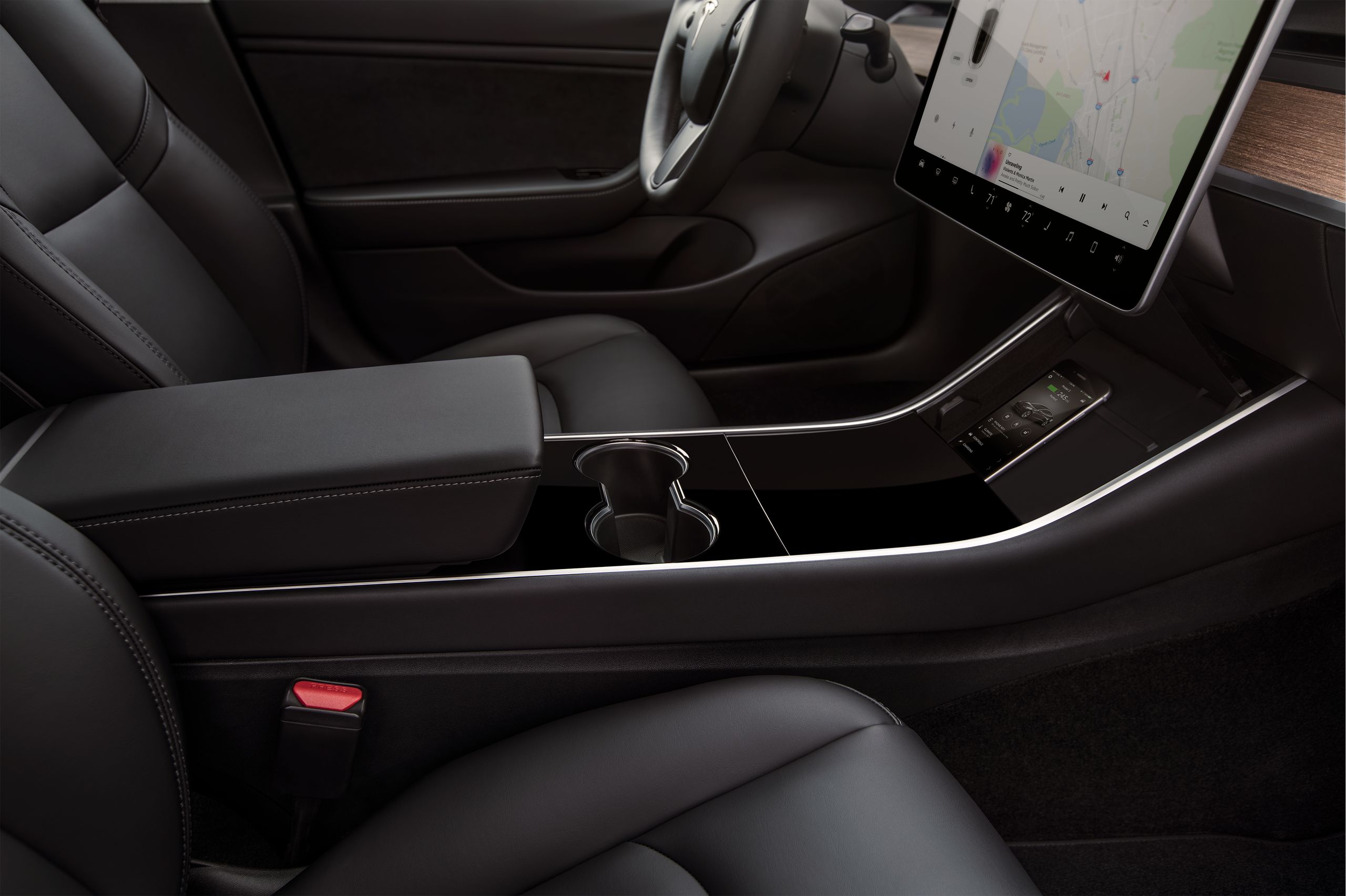
In the vicinity (just below) of the screen, where they belong. In the S and X they are just in front of the armrest.
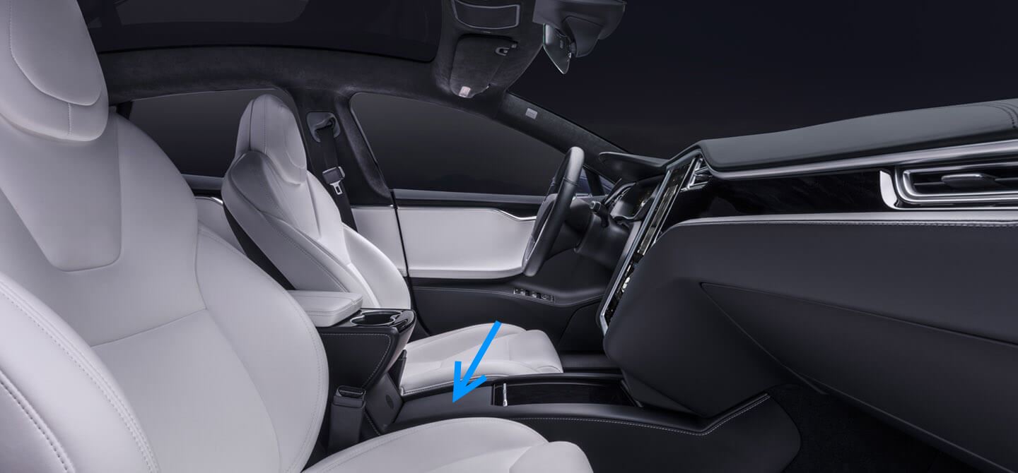
That lit flips forward and the phones are placed against it. But the armrest with the brilliantly placed cupholders is hanging over it, you can’t really see the phone when it’s in there. I’m not using it and have attached a phone holder just to the right of the screen. Much better. Fun fact is that if you close the lit, the room beneath it is open to the front, so anything you put in there will slide forward into the forward compartment, and then back underneath phone area. I’m still thinking what to do with that space, it is empty now.
Doors
Initially I really missed the pockets in the doors of my S. The 3 does have them, but at the costs of styling. Let me show you. First, the S has some flowing lines in the door, which look great especially with the ambient lights active (not shown on this photo).
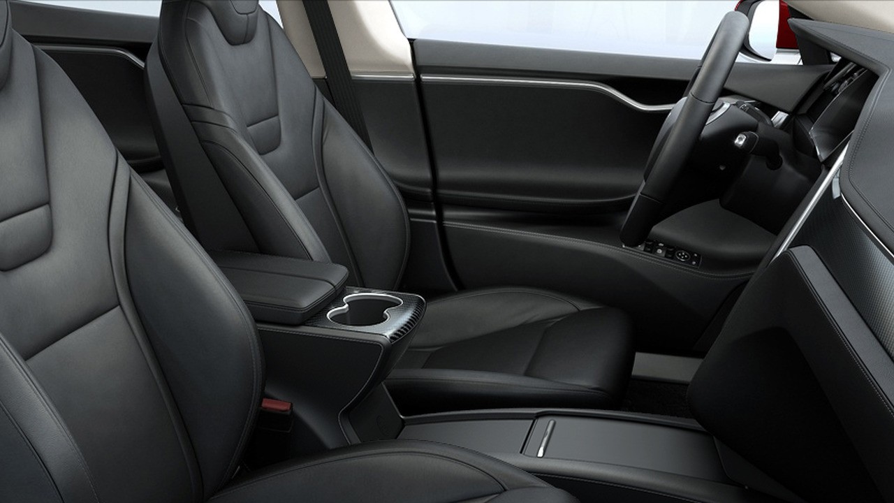
In the model X this flow is somewhat compressed (notice the missing gap between the ledges just behind the mirror buttons). But combined with the higher doors it allows for a storage pocket in the door.
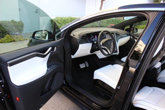
Slightly different, but still similar to the S, and more functional. In the model 3 it has become even more functional, looking like a regular car door. It is a choice, functioning over form, but I know I’m a sucker for beautiful details.
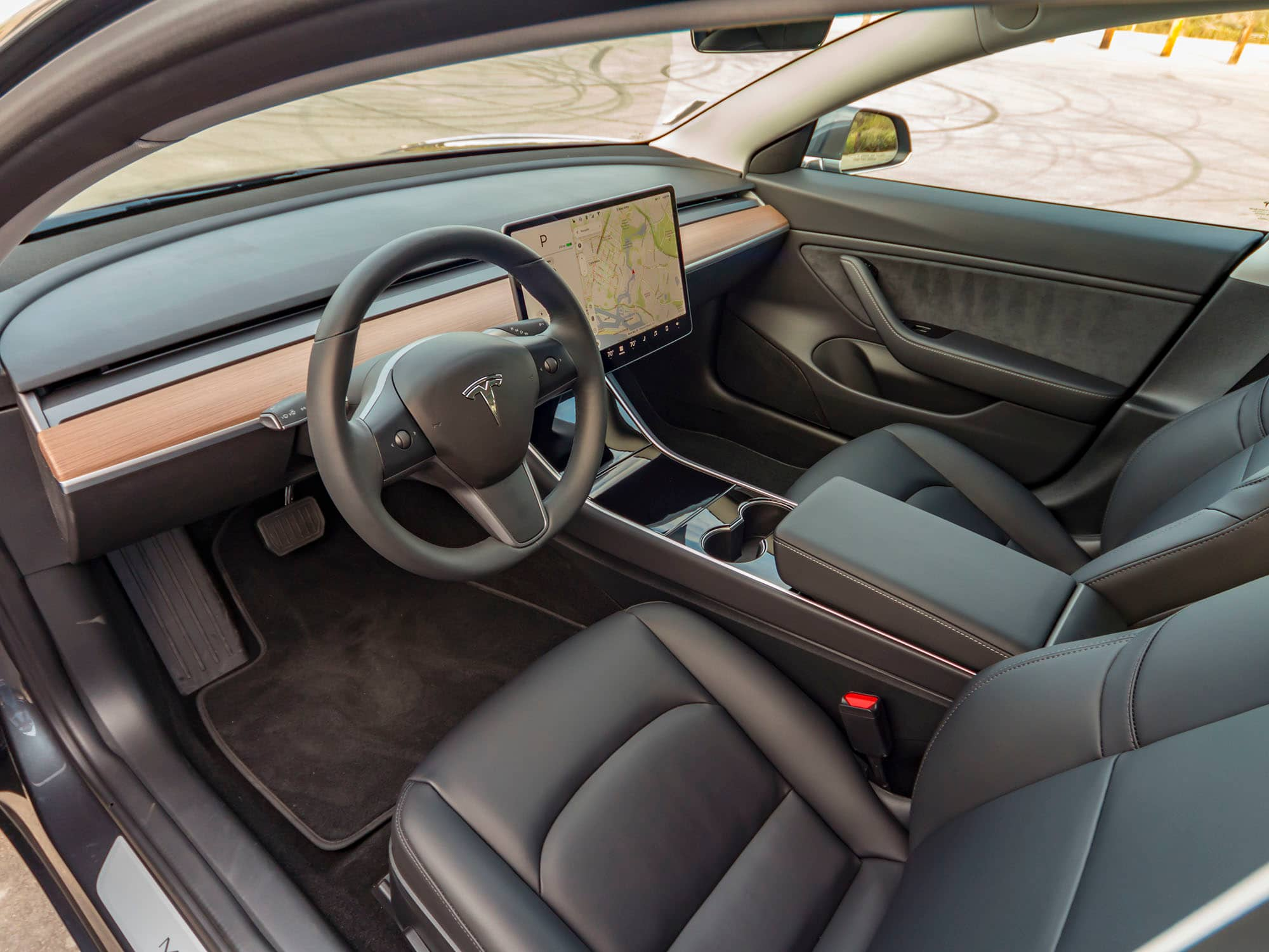
Still not sure if that is the best place of cupholders though, but it sure beats the original position in the S and X.
Seats
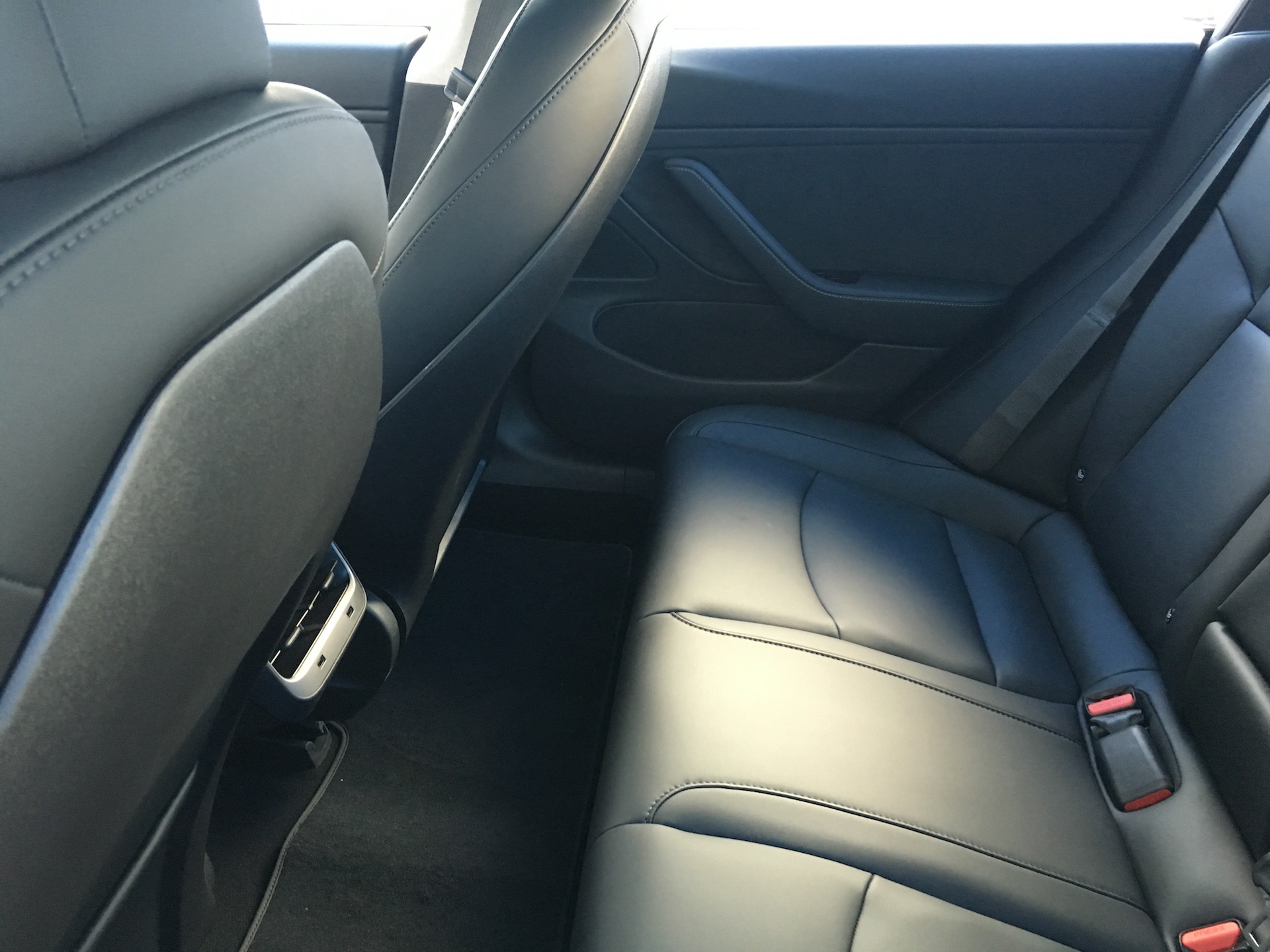
Something similar can be seen with the seats; the model 3 has small pockets on the rear of the front seats, but it kinda spoils the round lines of the seats. Same tradeoff, I understand. They sit quite well though.
Rearseats
The rear misses the three seats setting, it is a smaller car after all, but gains an armrest.
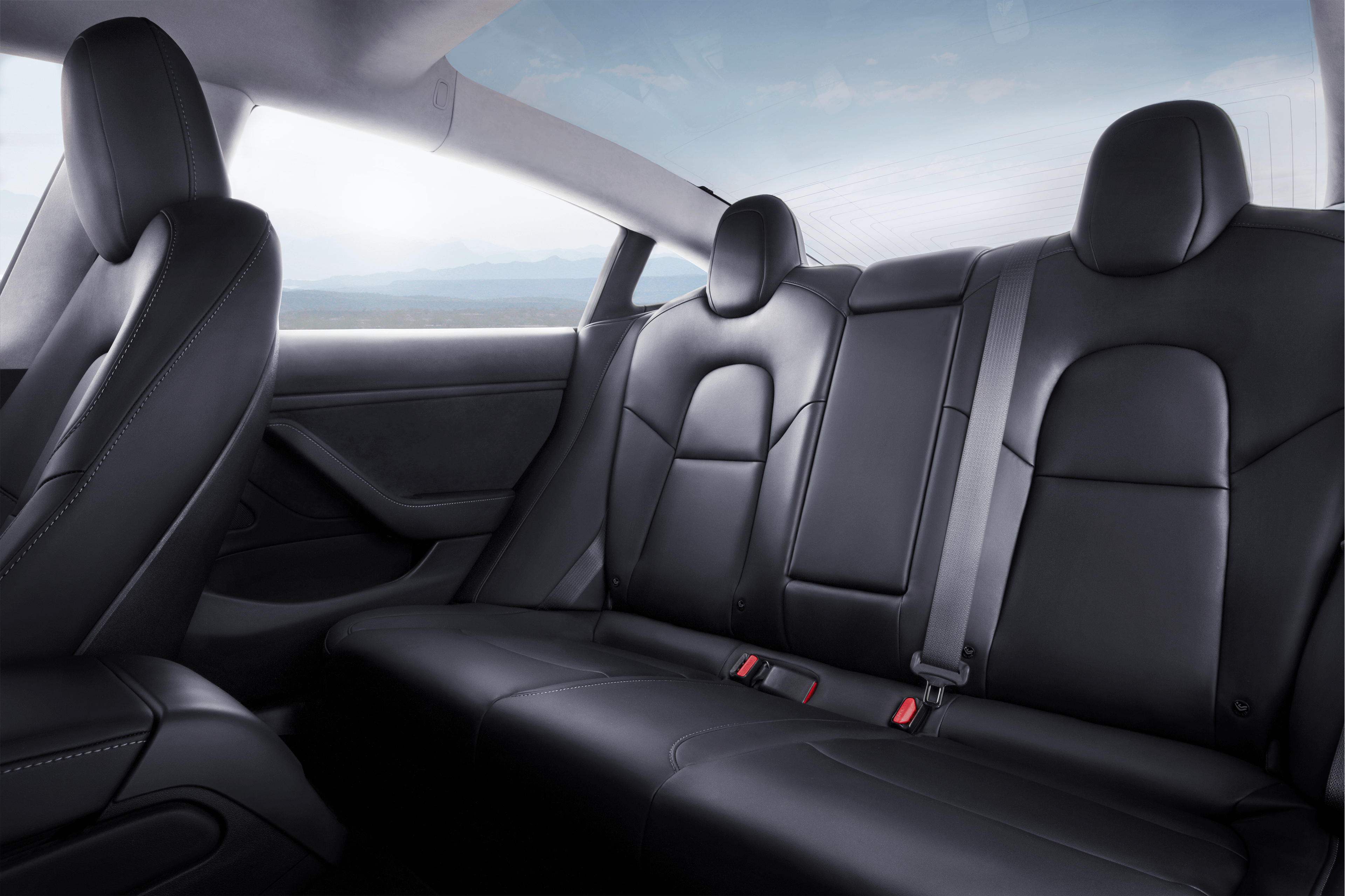
But the floormat still is not fastened decently.
First impression
So what was my first impression? Some good usability improvements which I would love to have in my S, but the overall interior quality felt less than my S. Which is a good thing of course; I would have hated to have spent more money, and not feel a difference. It increased my appreciation for my own car. Good.
But also compared to cars like the VW Golf or BMW 3 series it does not have the same feel of quality. Every time I get into one of those cars, they feel… Solid. Well rounded. Finesse. You run your hand over the dash and the chairs with a sense of beauty and awe, I did not have that in the 3. It is an opinion, so you are free to disagree. I do have that feeling with my S, BTW. But it probably isn’t Tesla “fault”, because I often feel the same when I get into American made cars; it is not without reason German made cars have a reputation. (Not referring to dieselgate here 😀 )
That said, not one second I would consider buying a Golf or BMW when having the 3 as an option. And I’m quite curious how the electric line of VW will look, and compare that to the 3.
So can I now please have my S back? 🙂
