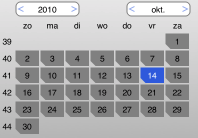
In the previous posts about UIOverlayView and KPMiniPickerView I’ve already talked about my calendar picker test case that I use to “hello world” new UI platforms. So far there is a Java Swing version, a JavaFX 1.3 version, the JavaFX 2.0 version is in the works, and there is a iOS (iPhone / iPad version).
The main excuse I had to write one for iOS is, because I found the normal picker to have a few drawbacks:
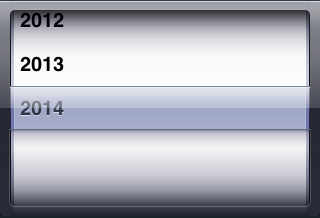
- It is inaccurate; if I want to go back, say, 10 days, I give the thing a swipe and have to hope it stops somewhere around 10 days.
- It takes up a big chunk of screen, relatively, for the information being shown.
- The styling of the UIPickerView in general is not easily fitted into another look and feel; the rolodex-in-a-box look is very distinctive.
It is totally clear what Apple tries to do with the UIPickerView, but I do not believe that UI controls modeled after real world things (like a rolodex) are a good idea. History has shown us that writing computer programs in languages styled after human languages (Cobol) is not working out well either; all though there is something in common, the two worlds are far more different than alike. And the more I see UI’s made up of thing resembling real world objects, the more I get the feeling that they are not working out very well (the occasional exception excluded naturally).
So therefor the normal style date picker may have some right of existence on the iPad, so I wrote KPCalendarPicker. Calendar is there to suggest it does more than simply selecting a date, but also takes locale settings into account, like first-day-of-week:

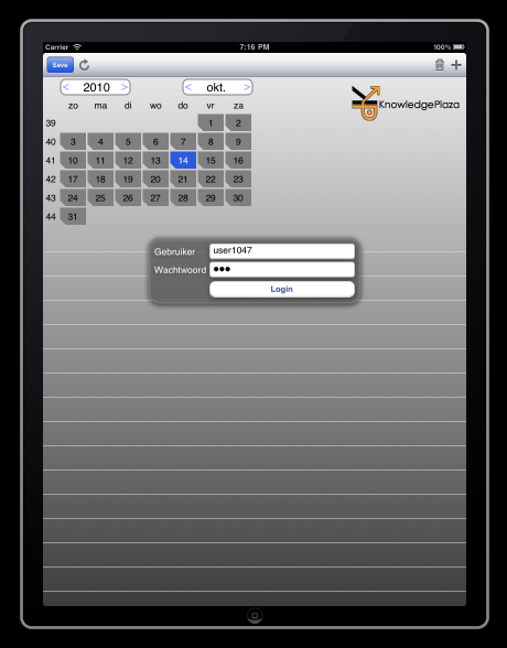
The KPCalendarPicker is being used in a hour registration application, but there is a issue with the KPMiniPickerView and losing drag focus which I hope to resolve someday. To see it in action:

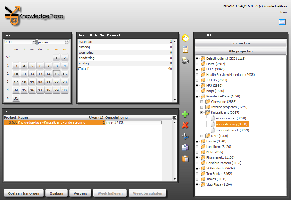
BTW, the hour registration also has a applet version, which uses the Swing version of the calendar picker (called JCalendarPicker) as can be seen in the top-left corner here:

Kia Toedler’s JCalendar component is a great component, but has too many embedded styling elements like the border and background color for my taste. JCalendarPicker simply uses existing controls without much additional styling and therefor easily adopts to new UI themes.
Anyhow, the code for the KPCalendarPickerView, together with all kinds of other iOS classes, is checked into sourceforge. So if you want to give it a spin (and hopefully commit back), you can find it under the project “KPiOS”. Usage is pretty straight forward, although with a twist of Java because I prefer the listeners pattern:
- (void)loadView {
	[super loadView];
	...
	// calendarPicker
	_calendarPicker = [[KPCalendarPicker alloc] initWithFrame:CGRectMake(x,y,w,h)];
	[_calendarPicker.dateSelectedListeners add:self selector:@selector(dateSelected:)];
	[self.view addSubview:_calendarPicker];
	...
}

- (void)dateSelected:(NSDate*)date {
	NSLog(@”dateSelected %@”, [KPUtil formatDate:_date]);
	...
}


Your component is horrible; even more usability than design wise.
Taking a bad working calendar created for the desktop screen and the mouse, and putting it on a smaller screen and an all touch device, is the worst idea I’ve seen for a long time.
I would throw my iPad against the wall, after unsucessfully trying to select anything in your calendar. The year and month chooser are… unbelievable.
I want Java on iOS.
But if I see posts like this, I’m thinking of Apple banning Java, JavaFX and the developers with their “useful and powerful” components was the right way to go.
You are welcome.
Your line is much better indeed, it took me a bit to logging straight. Never the less does the original line work correctly.
NSLog(@”%@”, [NSString stringWithFormat:@”dateSelected %@”, [KPUtil formatDate:_date]]);
should be written as
NSLog(@”dateSelected %@”, [KPUtil formatDate:_date]);